library(tidyverse)
library(soundeR)

plays_for_demo <- read_csv("https://www.mattwaite.com/sportsdatafiles/plays_for_demo.csv")You will know you have created something incredible when other people are still thinking about it 16 years later. I am Other People, and I’ve been obsessed with the New York Times’ Olympic Musical graphic from the 2010 Winter Olympics, where Amanda Cox turned the gap in finishing times in event finals into sound. I’m that person who randomly remembers it in conversations and pulls it up still. Sure, you can see that the gap between gold and silver was really small here, but what if you heard it instead to understand just how close .14 seconds really is? It was brilliant, captivating and lived rent free in my head since 2010.
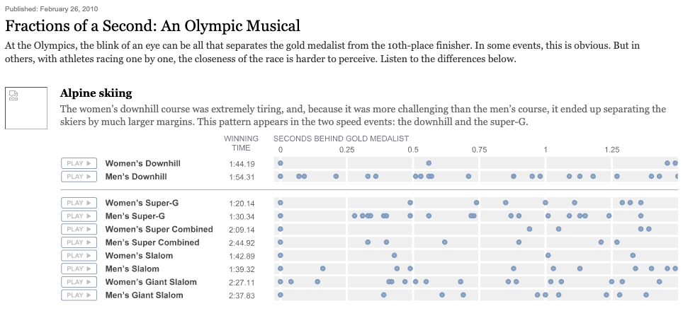
Over the years, I’ve wondered about teaching data sonification – the name given to turning data into sound – in various classes. Obviously it’s not a core skill, but anyone who has taught a data class or two knows there’s a handful of classes where students need to be focused on final projects or something and a little class demo that starts and ends during the meeting time isn’t a bad thing. I teach my data classes almost exclusively in R, so of course I went looking for a data sonification package in that language. I first did this years ago, and the results of those searches turned up libraries that were non-functional because time had left them behind or worse, so opaque and difficult to use that it would take me forever and a day to teach beginning students how to pull it off.
When I went and looked again recently, things hadn’t improved. What had? My ability to describe what I want and Claude Code’s ability to make it.
Enter SoundeR
Over a handful of days, my pal Claude and I set out to create a library that first turned data into sounds and second did it in a way that anyone with familiarity with tidyverse principles would get pretty quickly. What came out is soundeR, a library that maps tidy data to instruments, pitches, lengths and a few other little tricks to make … songs? … out of data. It will recreate that NY Times graphic pretty well note for note – the package has some luge data from the Milan winter olympics bundled with it. You can then output your sounds as audio files (mp3, wav) or, you can output them as video files, where the library uses ggplot to overlay the playhead and make your notes appear in motion. Sixteen years ago, that NYTimes graphic seemed like magic. Now it’s a function in a library that you can install today.
To be clear – I am a fruit fly on the shoulders of giants here. The real magic is the creativity to connect sound to data to illustrate something difficult to envision for people. What this library represents is an exercise in creating capacity. Not everyone can do magic, but some people might have ideas on how to use sound to make something hard to see perceivable. The more creative people have tools to make things the better, I believe.
Here’s the pkgdown documentation site, and here’s the Github repo if you have ideas of your own. You’ll have to install it with devtools or remotes from the Github repo for now because I’m not going to submit it to CRAN for the time being. People have feelings about AI generated code, and I’m not fully convinced I’ve got it fully right and so it stays on my Github account for now. Maybe someday it’ll be on CRAN, but not now. Not yet.
Turning football plays into sound
So what does this look like? Over the weekend of this writing, my beloved Nebraska Cornhuskers went to East Lansing, Michigan and defeated Michigan State. If you know nothing of college football, know this: Being a Nebraska fan is a special form of suffering. A once mighty program has been through decades of struggle, and it’s left scars. Nebraska beat Michigan State 31-13, which is a pretty convincing win on the road. But it didn’t feel like a convincing win until it was almost over. Being a Nebraska fan means never being able to relax until almost all possibility of calamity has passed, and that isn’t until much later than normal people would feel.
Believe it or not, you can hear my second half discomfort in the data.
What does it look like?
Let’s get set up with libraries and data. For this demo, I’ve pulled play-by-play data from the cfbfastR library, filtered out plays that aren’t passes or rushes (aka timeouts, punts, kickoffs, etc), and simplified the play_type column to just be pass or rush (instead of rushing touchdown or passing incompletion).
My vision here is to create a song where rushes are a cello note and passes are something distinct from the cello, like a trumpet. You can see what instruments are available to you – there’s 133 when you run instruments(). I did play around with this mixing and matching instruments for a while. Just a warning that it’s a deep rabbit hole.
Then, I want to make the pitch of the sound – the note – be the yards_gained. So the higher the yards gained, the higher the note. I also want the volumne of the note – how loud it is, to be how many expected points it added. So plays that didn’t do much to help win will be quiet, where big plays will be loud.
What does it look like? Or more to the point, what does it sound like?
plays_for_demo |>
  arrange(game_play_number) |>
  sonify_data(yards_gained, volume = EPA, voice = simple_play_type, instrument = c(Rush = "cello", Pass = "trumpet"), bpm = 180)
The arrange is there to ensure the plays are in order, then the main function here is sonify_data which does what it says on the tin. Where do the notes come from? That’s the first value, yards_gained. After that it’s options. The voice option enables multiple instruments based on a column – Pass or Rush – and instrument says what is what.
What does it look like when you combine visuals? Note that it takes about a second of render time for a second of sound time, so this is 22 seconds and that’s about as long as it takes to create the video.
plays_for_demo |>
  arrange(game_play_number) |>
  sonify_data(yards_gained, voice = simple_play_type, volume = EPA, instrument = c(Rush = "cello", Pass = "trumpet"), bpm = 180) |>
  sonify_video(
    "husker-plays.mp4",
    title = "Nebraska's offense vs Michigan State's defense",
    x_label = "Play number",
    y_label = "Yards gained",
    theme = ggplot2::theme_minimal(base_size = 20)
  )
And this is what you get:
Do you hear that part in the second half of the track where there’s just a bunch of zero yards gained sounds? Doesn’t matter if it’s a pass or a run, they aren’t going anywhere? That’s why the third quarter felt bad to me and many other Husker fans. Now you can hear what you felt in your gut. You can also hear that we passed the ball better than we ran it.
For me, the challenge now is how to teach this. My favorite thing in the library? It defaults to everything being in a major pentatonic scale, which helps the sounds not clash. But you can set the scale to “sad” and it switches it to a minor key. So you can make a loss sound sad.
Hopefully you’ll think of something you want to turn into sound, and if you have ideas for improvements, comments and pull requests are most welcome.